Remote Control

THE CHALLENGE

Design and develop a remote control that will be paired with our new in home leased video experience HNav. The remote should be paired with the navigator and honor the key principles of the user experience. The layout should be rethought, based on the customers priorities, and should be simple enough to operate even in the dark. Oh, and while you’re at it, can you upgrade the look and feel without skyrocketing the price.
THE SOLUTION
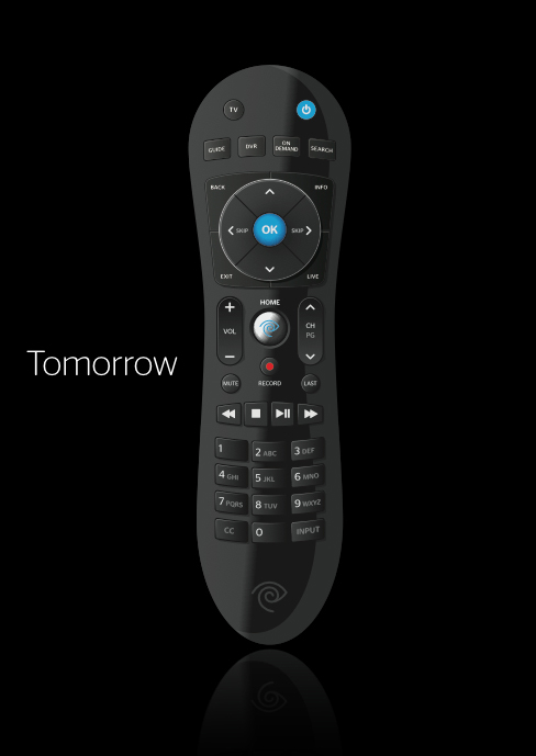
We had the luxury of being able to design HNav and the remote in tandem. We approached all feature design from the perspective of both the remote and the interface. Starting with the experience and brand guidelines, we executed concepts that were communicated upwards to executive management and outward to vendors. We developed working prototype units that we used in-house while developing code, as well as tested with customers. We iterated on the design, tested some more, and even pivoted along the way. The end result is a reduced button count, an increased perception of quality, and we threw in some motion activated backlighting and RF4CE capability for good measure. All with only a slight increase in the cost per unit.
TODAY
We started with an analysis of the current state of the remote. We evaluated all our competitors remotes, as well as the many remotes currently available in the field. But we didn’t stop with MVPD remotes, we also considered devices from OTT services like Roku and Apple. During this evaluation we were keenly aware that current remotes are far too complex for the average user.
With a good understanding of the landscape we turned to the experience and the brand. Our brand guidelines offer the direction of simple and modern, but not simplistic or cutting-edge. Initial concepts were reduced and approachable, but not overly techy.
- 63 buttons
- No visual hiearchy
- Does not support the UX features
- Ignores the customers priorities
- Can not be operated without looking at it
- Does not reflect user experience or brand
- Overall looks and feels cheap

The Current Landscape
We also had another consideration to keep in mind, which was the ever increasing availability of first or third party services interfacing with our video products. We were well aware of the capabilities, current or future, of both TWC TV and companies like Twitter, Facebook, Zeebox, etc. With all these advanced features coming online in the near future, we knew that we didn’t have to boil the ocean with our remote.
We created three silos for our concepts. A standard remote that would still be reduced but familiar to current MVPD subscribers. A more simple concept that would really reduce the button count and as a result rely more heavily on the user interface to complete tasks. And finally something very innovative, and potentially expensive. Something that would really blow people away, but might risk violating our brand guidelines, and may end up being a premium for the customers.
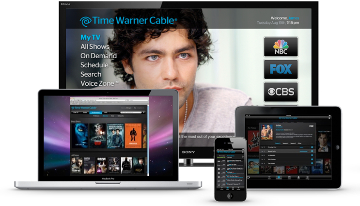
TWCTVs companion features offer STB control
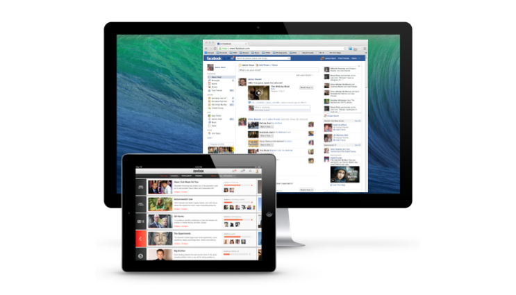
3rd parties like Zeebox, and SeeIt offer control of the STB. Even Facebook is interested
Input from Marketing
At this point we turned to paper sketching. We created piles of concept sketches. Some started with the form and worked back to the button layout, others used the button layout and proximity to drive the form. We also worked with the marketing department to solicit feedback and unique concepts from them and their agency.
To help realize these concepts and gauge their viability we engaged with a selection of vendors to create CAD models of our chosen 3 concepts. Where someone like Apple will really push the capabilities of their vendors, we knew we had a product to deliver and needed to ensure at least an understanding of the viability of our concepts in physical form. We also don’t staff industrial designers, so this was an opportunity to reach out and gather input from someone more skilled in the art.


Prototyping

After visualizing a collection of concepts within our three verticals, hardware manufacturer Woojin was on-boarded to develop physical models and working prototype units. This concept was rejected because the keyboard implied a level of complexity that wasn’t intended.
In april of 2013 we were invited to Comcast to experience their relatively new X-1 product, and get a sneak peek at X-2. After spending some time with Comcast’s new remote it was decided to reject the current design path in favor of a more traditional approach. We reverted to our more “standard” concept and immediately went back to the drawing board. Now that we had a concept, and executive backing, it was time to build some working prototypes. The first run produced 50 working units that were divided up between engineering and the UX team for testing. Using Hnav running in a browser and an IR repeater, we were able to test users on HNav with both the current remote control and the new version. We ran our tests in NY & Dallas with 32 customers. These tests were also our first instance of using eye-tracking. The setup used a pair of glasses that could not only track the users eye movement, but also display their current gaze superimposed over the subject matter on a monitor in the observation room This allowed us to follow peoples progression through the UI, or more importantly, across the remote in real time.

Version 2: Rendering of version 2 that was tested in NY & Dallas and initially deployed to the HNav employee beta trail

We set up a standard A/B configuration for our test. We brought both the old and new remotes, and asked our users to complete common tasks using our new experience HNav, like finding and recording favorites shows, managing their DVRs, stuff like that. All customers were asked to wear the eye-tracking glasses, with some customers starting with the old remote, and some with the new. On the left you see the accumulated heat map of users gaze across the new prototype remote.
As a result of the usability study, combined with the heat map, a number of changes were made to the remote control before we committed to the final production run. Despite the long period of time spent looking at the Menu button, users still didn’t understand it’s use. As a result we have moved the Menu button to the middle and renamed it Home. A few users struggled to notice the Record button so we have changed the icon color back to red and moved the Record button to the center of the remote below the Home button. Only a select few users correctly guessed that the channel +/- button was also used to page while viewing lists and grids so we added the “PG” label to the channel button. Exit wasn't understood as expected so we restored the "Live TV" button. And finally we changed the spacing and actuation of the buttons themselves after witnessing several customer unintentionally depressing multiple buttons simultaneously.
After making these changes we produced 3,000 units to deploy to our beta trial, and followed up with in-home interviews conducted with 12 of the beta participants, and the response was overwhelmingly positive.